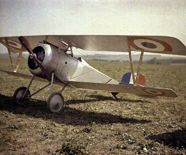
The London Chamber Orchestra reaching its centenary year in 2021 has provided an exciting opportunity to draw on the design elements of our founding decade.
An area that was particularly enjoyable to research was choosing new typefaces for both our 2020-21 and 2021-22 Seasons as we celebrate 100 years of LCO. The 1920s was a period of exceptional graphic experimentation and innovation – reflected perhaps in being the decade the phrase ‘graphic design’ was allegedly first coined by typographer William Addison Dwiggins. In wanting to choose typefaces from LCO’s early years, we found an almost overwhelming range of eye-catching typefaces to choose from. Our final selections included the strikingly geometric Erbar Neo Mini, created in 1922, and the lighter, delicately irregular Neue Kabel, originally developed in 1927.
Another area of influence for us was researching methods of 1920s colour photography. Autochrome plates were the first widely used method of colour photography and dominated the early twentieth century, before being overtaken by colour film photography in the 1930s. Autochromes are characterised by gentle washes of luminous colour and a hazy, grained texture. The limitations of the Autochrome additive colour process mixing red, green and blue resulted in a distinctly restricted colour palette, which became the source of the colours we used for LCO’s main Season concerts.


